American Tire Distributors
Homepage Redesign
UX Design Consultant
March 2021 - present
CLIENT BACKGROUND
American Tire Distributors (ATD) is one of the largest tire distributors in America. They have several digital products that are used by their customers to sell tires and manage their tire shops.
OPPORTUNITY
In 2021, ATD set out to enhance their digital experience. They teamed up with DMI to rethink their online and mobile experiences. This led to the creation of their ATD mobile app and ATD Pay app, and the complete redesign of their ATD Online experience. While revamping their online experience, some areas of focus were a cleaner search function, proper product listing pages, and a modernized checkout experience. This project required continuous collaboration between Product Owners, stakeholders, and the UX team.
ATDO Homepage
ONLINE EXPERIENCE
ATD has the opportunity to wow and welcome their customers. The homepage sets the tone for the rest of the experience. Based on data, user interviews, and personas, we were able to identify the two primary functions users are expecting when coming to ATD Online.
-
Front of house users expect to be able to find and sell tires and wheels quickly and easily. This includes an easy to use search, proper product listing pages, and a quick and efficient checkout process.
-
Back of house users want us to help them run their business. This means giving insights into sales, accounting functions, and ability to order mass quantities.
The homepage has been a large undertaking for redesigning the digital experience to meet these core functions. Using data we’ve collected from content square and user testing and first impression testing, we’ve recreated the homepage to meet the users’ needs.

Data & Benchmarking
USABILITY TESTING
Usability testing uncovered opportunities with discoverability. User feedback indicated the most important function was search. To meet all user needs, we needed to considered several different modalities when searching for products.
ANALYTICS
Leveraging Content Square’s analytics, we reviewed metrics for the homepage to validate findings from usability testing. Data showed that search was by far the most used and most profitable element on the page.
COMPARING/BENCHMARKING
Based on our findings, we believed that there was an opportunity to add more value by increasing the scale of the search component. We explored different options by comparing/benchmarking ways different industries design search functionalities to meet customer needs. Started within the industry, looking at companies like Goodyear and Discount Tire. All industry websites had search as their most prominent feature on the homepage. We then benchmarked outside the industry, looking for search heavy websites and how they handle it.

Low Fidelity Design Workshops
QUESTION
How might we design the homepage to address the needs of our three user types?
PARTICIPANTS
Mike Knauer, Director of UX
Yzella Vidaurre, Junior UI Designer
AGENDA
-
Reviewing user interviews about previous homepage
-
Created sitemap for the navigation
-
Set time to work on our own and build out some ideas
-
Came back together to discuss ideas/iterations and identify what we liked from various designs
-
Multiple sessions of that until we came up with the directions we wanted to further explore
-
Finalized 3 versions and took them to stakeholders
-
Agreed on best option and took that into high fidelity and later user testing
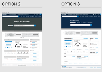
Low Fidelity Wireframe Iterations

HiFi Design & Testing
WHERE WE LANDED
-
Front & center, clear search functionality
-
Action items/messages have a more clear callout
-
Better navigation
-
Widgets for helping to run their business
-
Tiles to expose account/site functionality
TESTING
Does this search meet needs/expectations?
Is it clear the different ways of searching?
Is the marketing widget helpful for giving insight in the apex dashboard?
Are the actions items visible enough?
Are the widgets helpful? Are we showing the correct things to make them useful?
RESULTS
Overall the new homepage tested extremely well with users. They were very happy about the improved search feature and overall look and feel of the homepage.


