iClicker
Homepage Redesign
UX UI Design Consultant
Sep 2019 - Jul 2020
CLIENT BACKGROUND
iClicker is a participation tool for college and university classes to keep students engaged and allow professors to understand information retention during and after class.
OPPORTUNITY
Many students were often left confused after the account creation process. This confusion put a burden on the instructors to deal with questions and students being unprepared to begin using the tool.
The goal was to create a new onboarding process that guided students through creating an account that left them feeling prepared and confident to begin using iClicker in class. In turn, helping instructors have a smoother start to their semester and wanting to continue using iClicker.
APPROACH
Research data analysis
Competitive & Comparative Analysis
User Surveys (instructors)
Feature/Goal Prioritization
User Stories
User Journeys & Flows
Usability Tests (with students)
Paper Prototyping
Whiteboard & Sticky Note Sessions
iClicker Student App
A NEW ONBOARDING EXPERIENCE
iClicker had the opportunity to relieve a major pain point for their users by creating a brand new onboarding experience. Giving their student users a good onboarding experience lays the groundwork for how they feel about the app as a whole. Therefore, it’s in the business’ best interest to make sure it’s a great experience.
Major objectives for the Onboarding designs:
-
Create an onboarding flow that is easy for users to follow
-
Make sure users understand what is needed to complete the signup process
-
Make sure users know how to use the tool
-
Showcase the app’s functionality available to users
Understand
EMPATHIZE & DEFINE
-
Understanding the pain points of the current onboarding process based on previous research findings and sending out a survey to current users.
-
Created user stories to get a better understanding of what a successful onboarding experience would look like
-
Prioritized end goals for first release and future releases
-
Found examples of good onboarding experiences from other products
-
Mapped out user journeys of process
-
Brainstormed possible user flows while trying to solve for end goals
Early Ideations
PAPER PROTOTYPE & LOW FIDELITY WIREFRAMES
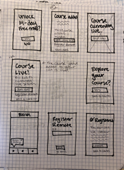
We took our user flow ideas into paper prototypes to get feedback from our UX peers. Through that process we were able to see which ideas we needed to change before heading into testing with real users.
After getting initial feedback from the paper prototype, we created low fidelity digital wireframes to take into testing with users. During the first round of testing with users, 3 different onboarding flows were presented for feedback.
TESTING QUESTIONS
Is this enough information?
Do you understand what you need to do to finish the signup process?
Do each of the flows make sense?
What do you expect out of an onboarding experience?
Is there anything missing?
Finalizing Designs
PAPER PROTOTYPE & LOW FIDELITY WIREFRAMES
Taking the feedback that we received in the first round of user testing, we zoned in on two options for the new onboarding experience. We took those two options into high fidelity designs which then were taken into the final round of user testing.
TESTING QUESTIONS
Which flow do you prefer for onboarding?
Does this meet your expectations for an onboarding experience?
Do you know what is required to finish the onboarding process?
Do you understand what functionality the app has to offer?
FINAL DESIGNS
Based on the final feedback we received from user testing, we were able to select the direction we wanted to take the onboarding experience. After some last updates to the screens, we produced the final designs to hand off the the client.
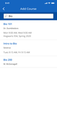
The final designs gives users a great onboarding experience. It walks them through the process so that they understand what is expected of them to complete the signup and gives them useful information about how they can use the tool.
Illustration Designs
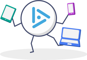
ADDING DELIGHT THROUGH ILLUSTRATIONS
iClicker liked to keep their products having a fun, light-hearted tone to them. We achieved this through the copy throughout the platform, but also through illustrations. These are some examples of the illustrations I created to go in the iClicker experience.


